Zuma
Professional
- Učlanjen(a)
- 19.05.2009.
- Poruke
- 12.714
- Pohvaljen
- 28.797
Evo nečeg zaista izuzetnog.
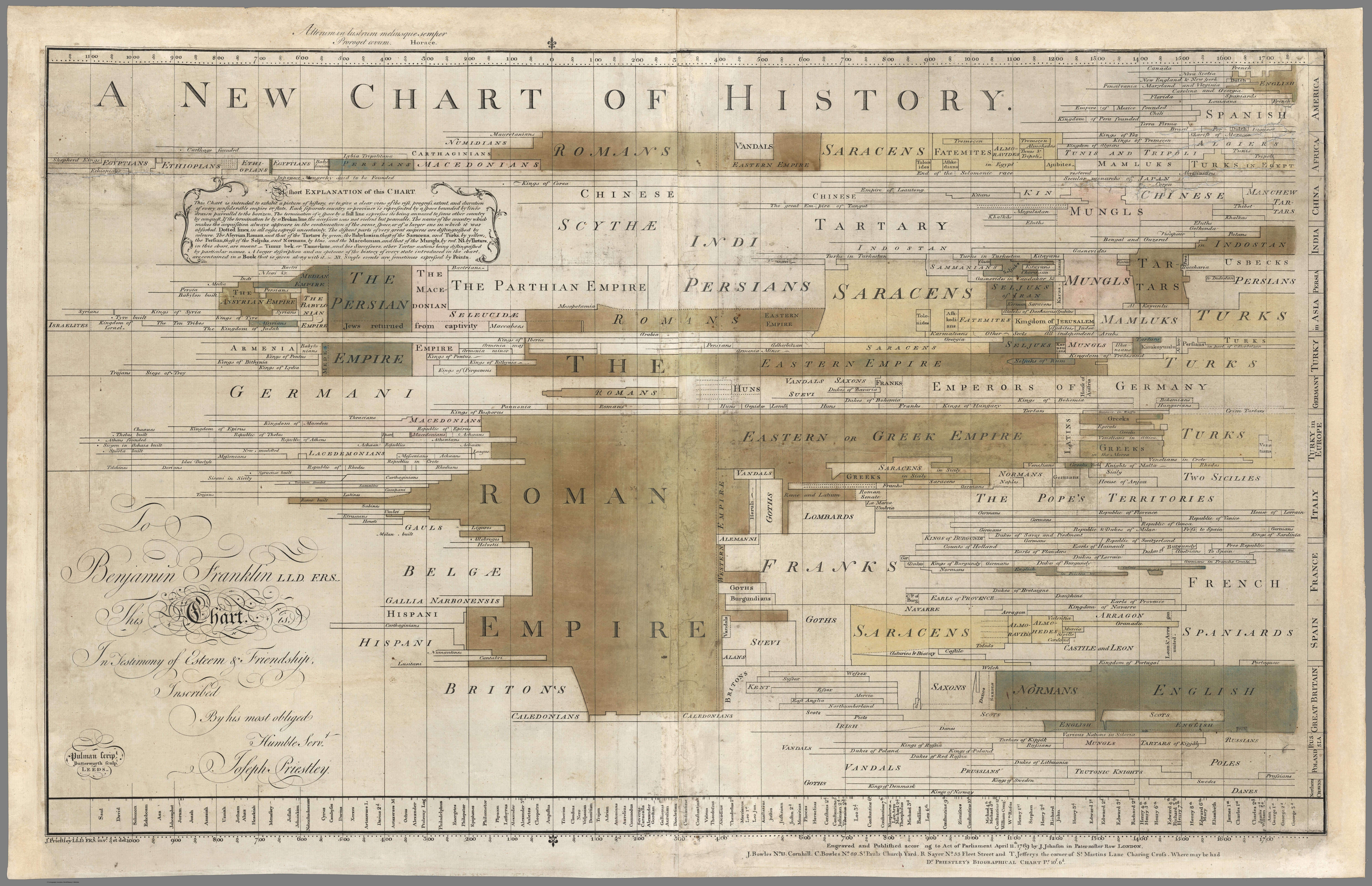
Godine 1769. Joseph Priestley iz Londona objavio je svoju ogromnu "kartu istorije sveta" posvetivši je Bendžaminu Franklinu. Ideja mu je bila da pokaže da se istorija ne može shvatiti kao niz odvojenih priča o narodima ili mestima, već da je sve važno, da je sve međusobno povezano i da bi bilo izuzetno korisno da se svi ti odnosi mogu vizuelno predstaviti prostornim odnosima. Tako je popularisao i 2D "timeline"-"prostornu" prezentaciju podataka koja će kasnije postati izuzetno korisna i veoma često korišćena. Do 1816. karta je imala čak 15 izdanja a on je na kraju za ovo delo bio nagrađen počasnim doktoratom.
In their Cartographies of Time, Rosenberg and Grafton describe Priestley’s charts as “masterpieces of visual economy”. To use a modern phrase, they enabled contemporary viewers to see “history at a glance.” In his Description of a New Chart of History, also published in 1769, Priestley wrote:
Priestley’s two charts were tremendously influential.
“Within very few years, variations on Priestley’s charts began to appear just about everywhere. When his own charts were not copied outright, they were adapted and interpreted, and, over the course of the nineteenth century, envisioning history in the form of a timeline became second nature.” (Rosenberg and Grafton, 130)
Evo dve verzije. Prva je nešto malo manje rezolucije ali se zato vide boje, a druga je zaista detaljna, velike rezolucije. Dakle, ako vam je u školi istorija uvek izgeledala kao razbijeni krčag razbacanih, haotično nepovezanih krhotina vrlo nejasnih odnosa, evo leka.


Godine 1769. Joseph Priestley iz Londona objavio je svoju ogromnu "kartu istorije sveta" posvetivši je Bendžaminu Franklinu. Ideja mu je bila da pokaže da se istorija ne može shvatiti kao niz odvojenih priča o narodima ili mestima, već da je sve važno, da je sve međusobno povezano i da bi bilo izuzetno korisno da se svi ti odnosi mogu vizuelno predstaviti prostornim odnosima. Tako je popularisao i 2D "timeline"-"prostornu" prezentaciju podataka koja će kasnije postati izuzetno korisna i veoma često korišćena. Do 1816. karta je imala čak 15 izdanja a on je na kraju za ovo delo bio nagrađen počasnim doktoratom.
“This Chart is intended to exhibit a picture of history, or to give a clear view of the rise, progress, extent, and duration of every considerable empire or state.”
“Each separate country or province is represented by a space bounded by line drawn parallel to the horizon. The termination of a space by a full [i.e., solid] line expresses its being annexed to some other country by conquest. If the termination be by a Broken line, the accession was not violent but peaceable. The name of the country, which make the acquisition, always appears in the continuation of the same space, or of a larger one in which it was absorbed. Dotted lines, in all cases, express uncertainty. The distant parts of very great empires are distinguished by colours.”
In their Cartographies of Time, Rosenberg and Grafton describe Priestley’s charts as “masterpieces of visual economy”. To use a modern phrase, they enabled contemporary viewers to see “history at a glance.” In his Description of a New Chart of History, also published in 1769, Priestley wrote:
“If the reader carry his eye vertically, he will see the contemporary state of all the empires subsisting in the world, at any particular time. He may observe which were then rising, which were flourishing, and which were upon the decline. Casting his eye a little on each side of the vertical line, he will see what empires had lately gone off the stage, and which were about to come on.”
Priestley’s two charts were tremendously influential.
“Within very few years, variations on Priestley’s charts began to appear just about everywhere. When his own charts were not copied outright, they were adapted and interpreted, and, over the course of the nineteenth century, envisioning history in the form of a timeline became second nature.” (Rosenberg and Grafton, 130)
Evo dve verzije. Prva je nešto malo manje rezolucije ali se zato vide boje, a druga je zaista detaljna, velike rezolucije. Dakle, ako vam je u školi istorija uvek izgeledala kao razbijeni krčag razbacanih, haotično nepovezanih krhotina vrlo nejasnih odnosa, evo leka.

