neko_daleko
Novice
- Učlanjen(a)
- 26.04.2007.
- Poruke
- 22
- Pohvaljen
- 0
Unapred se izvinjavam sto cu ovo da kazem, nikad nisam planirao da uznemirim ljude na ovom sajtu. Cutao sam I gledao kako napreduje usce I na pocetku sam bio pun nade. Ali kako su skice evoluirale moje su nade postajale skromnije. Ipak sam se tajno ponadao da ce unutrasnjost biti uradjena u nekom adekvatnom stilu. Ovih zadnjih nedelju dana kako sam gledao rezultate nekako se u meni pojavila duboka mrznja ovog projekta. Nisam ni sam znao zasto je to, ali sam prvo primetio kako sam projekat lici na nesto sto nije uopste u sinhroniji duha grada. Prvo me je zapanjila absolutna dominacija pravih linija i sterilitet prostora. Na prvi pogled sam mislio da je to mozda I bila concepcija projekta. Prodaja narodu ideje zapada koji je dosao u Beograd ( Iako I na zapadu vole I prirodu a I oble linije koje associraju na neznost I mekanost). Nazalost sto sam vise gledao u konacni dizajn to se dublja neugodnost pojavila u meni. Izbor boja mi je uvek bio cudan, I nisam mogao da shvatim zasto takva kombinacija cvene bele i crne.. tako uznemiravajuce boje pune snage, i neke pritajene morbidnosti. Nisam mogao da shvatim gde sam video te boje i zasto me nerviraju ... i onda mi je bilo jasno ... pa naravno .. nacisticka zastava.
http://www.nazi-lauck-nsdapao.com/FLAG201low.jpg Sklonjen embeded image, ostavljen link. Moderator
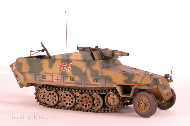
A sto se tice same strukturalne kompozicije, to me totalno podseca na nacisticki stil komuniciranja sile, nekompromisa, i glomaznosti sto mozete videtu u dizajnu svega sto je taj sistem stvorio, od vojnih automobila

do zgrada.

Sto se enterijera tice, manje mi lici na udoban prostor u kome je covek spreman da se oprosti od svog novca, i vise na centar za sterilizaciju i euthaneziju gde ces da se oprosctis od svojih imperfektnih rodjaka. Kad pogledam skice unutrasnjosti jednostavno se najezim i ocekujem da ce interfon da prozove red mentalno zaostalih na tusiranje u sobi A357. Ovo lici na trzni centar u kome mozes naci koji god proizvod oces ali da izgubis dusu. Mozda bi trebao da se zove centar izgubljenih dusa, ili sajmiste 2.
(And now for those of you who don't know the Serbian language, and will probably very badly misinterpret the post above without a translation in English)
I apologize ahead of time for saying my piece, I never planed to be a disturbing presence on this site. I silently watched the progress of this project and in the beginning I was full of hope. As plans kept evolving I lowered my expectations. Despite this I secretly clinched on to hope that the interior of the building will be adequately done. These last couple of weeks, as I watched all the work come together a deep seeded hatred for this project awoke in me. I didn't know why that was, but I first noticed that the project is not in synchrony with the spirit of the city. At first I was stunned by the absolute dominance of straight lines and the sterility of the place. At first I thought that this could be the conception behind the project. Selling the idea that the west has arrived in Belgrade ( despite the fact that in the west people also love nature and soft curvy lines that associate with softness and tenderness). Sadly the more I stared at the final design the more unnerved I became. The choice of colors was always strange to me and I never understood the choice of red white and black, such disturbingly powerful colors, filled with hidden morbidity. I didn't understand where did i see those colors and why do i not like them.. and then it was clear to me ... why of course .. the nazi flag. And as far as the structural composition is concerned, it totally reminds me of the nazi style of communicating something powerful, uncompromising, and gargantuan. You can see that in the design of everything that came out of that system from their military vehicles, to ther buildings. As far as the interior is concerned, it doesn't look like a place where a person would willfully part with their money, but a center for sterilization and euthanasia where a person would part ways with their imperfect cousins. Looking at the interior is a hair raising experience where I expect the voice on the loudspeaker to call out the column of mentally defective for a shower in the room A357. This looks like a shopping center where you can buy any product you want and in exchange loose your soul. Maybe it should be called the center of lost souls or Sajmiste 2 (Sajmiste was a site of a concentration camp during ww2 and it was located across the street from this place)
http://www.nazi-lauck-nsdapao.com/FLAG201low.jpg Sklonjen embeded image, ostavljen link. Moderator
A sto se tice same strukturalne kompozicije, to me totalno podseca na nacisticki stil komuniciranja sile, nekompromisa, i glomaznosti sto mozete videtu u dizajnu svega sto je taj sistem stvorio, od vojnih automobila

do zgrada.

Sto se enterijera tice, manje mi lici na udoban prostor u kome je covek spreman da se oprosti od svog novca, i vise na centar za sterilizaciju i euthaneziju gde ces da se oprosctis od svojih imperfektnih rodjaka. Kad pogledam skice unutrasnjosti jednostavno se najezim i ocekujem da ce interfon da prozove red mentalno zaostalih na tusiranje u sobi A357. Ovo lici na trzni centar u kome mozes naci koji god proizvod oces ali da izgubis dusu. Mozda bi trebao da se zove centar izgubljenih dusa, ili sajmiste 2.
(And now for those of you who don't know the Serbian language, and will probably very badly misinterpret the post above without a translation in English)
I apologize ahead of time for saying my piece, I never planed to be a disturbing presence on this site. I silently watched the progress of this project and in the beginning I was full of hope. As plans kept evolving I lowered my expectations. Despite this I secretly clinched on to hope that the interior of the building will be adequately done. These last couple of weeks, as I watched all the work come together a deep seeded hatred for this project awoke in me. I didn't know why that was, but I first noticed that the project is not in synchrony with the spirit of the city. At first I was stunned by the absolute dominance of straight lines and the sterility of the place. At first I thought that this could be the conception behind the project. Selling the idea that the west has arrived in Belgrade ( despite the fact that in the west people also love nature and soft curvy lines that associate with softness and tenderness). Sadly the more I stared at the final design the more unnerved I became. The choice of colors was always strange to me and I never understood the choice of red white and black, such disturbingly powerful colors, filled with hidden morbidity. I didn't understand where did i see those colors and why do i not like them.. and then it was clear to me ... why of course .. the nazi flag. And as far as the structural composition is concerned, it totally reminds me of the nazi style of communicating something powerful, uncompromising, and gargantuan. You can see that in the design of everything that came out of that system from their military vehicles, to ther buildings. As far as the interior is concerned, it doesn't look like a place where a person would willfully part with their money, but a center for sterilization and euthanasia where a person would part ways with their imperfect cousins. Looking at the interior is a hair raising experience where I expect the voice on the loudspeaker to call out the column of mentally defective for a shower in the room A357. This looks like a shopping center where you can buy any product you want and in exchange loose your soul. Maybe it should be called the center of lost souls or Sajmiste 2 (Sajmiste was a site of a concentration camp during ww2 and it was located across the street from this place)


